Unifying Elisa Viihde
2018 – 2022 • Role: Design Lead, UX/UI Design
Elisa Viihde is one of the most popular Finnish entertainment services. When I started to there in 2016, each designer worked on a separate platform, which lead to a disorganised UX. In 2018 I initiated the work to unify Elisa Viihde, by pushing the product in a single direction as well as lobbying for an organisational change.
I facilitated design sprints, coordinated with our business unit to strategically prioritise the work, and cooperated with the development teams to get it done. Through it all, I gently proposed changes in the way we work, and continuously gathered the different stakeholders together in order to break silos. In the mean time, I also did the hands-on UX/UI design for all platforms: mobile apps, Smart TV, set-top box, and online.
As of 2022, we had a full design team working together on the product, we’d streamlined our workflow in Figma in a way that facilitates a unified design across platforms, and the user experience of Elisa Viihde is much more harmonised.
The biggest challenges in this project have been to get continuous buy-in from business, and to measure the long-term impact on the end user. However, the internal change can be more easily seen: we’re working much more efficiently, and everyone – design, development and business – wants to just work towards a unified Viihde now.

Elisa: Multi-brand Design System
2021 • Role: Design Lead, UX/UI Design
For the Design System at Elisa, I designed a dark theme and a workflow that supports a multi-brand Design System.
Through our work with unifying Elisa Viihde, we realised that our Elisa-wide Design System should provide different sets of colours that still feel like Elisa. I facilitated collaboration with other teams who were using similar (dark) colour sets for their Elisa products, and started to work on a unified dark theme, including a workflow that’s ready to implement multiple other themes if we need them.
Now, designers and developers can use any component from our Design System and use them in any theme. This has made our workflow much more efficient and should eliminate the ‘wild’ designs that aren’t connected to the Design System.

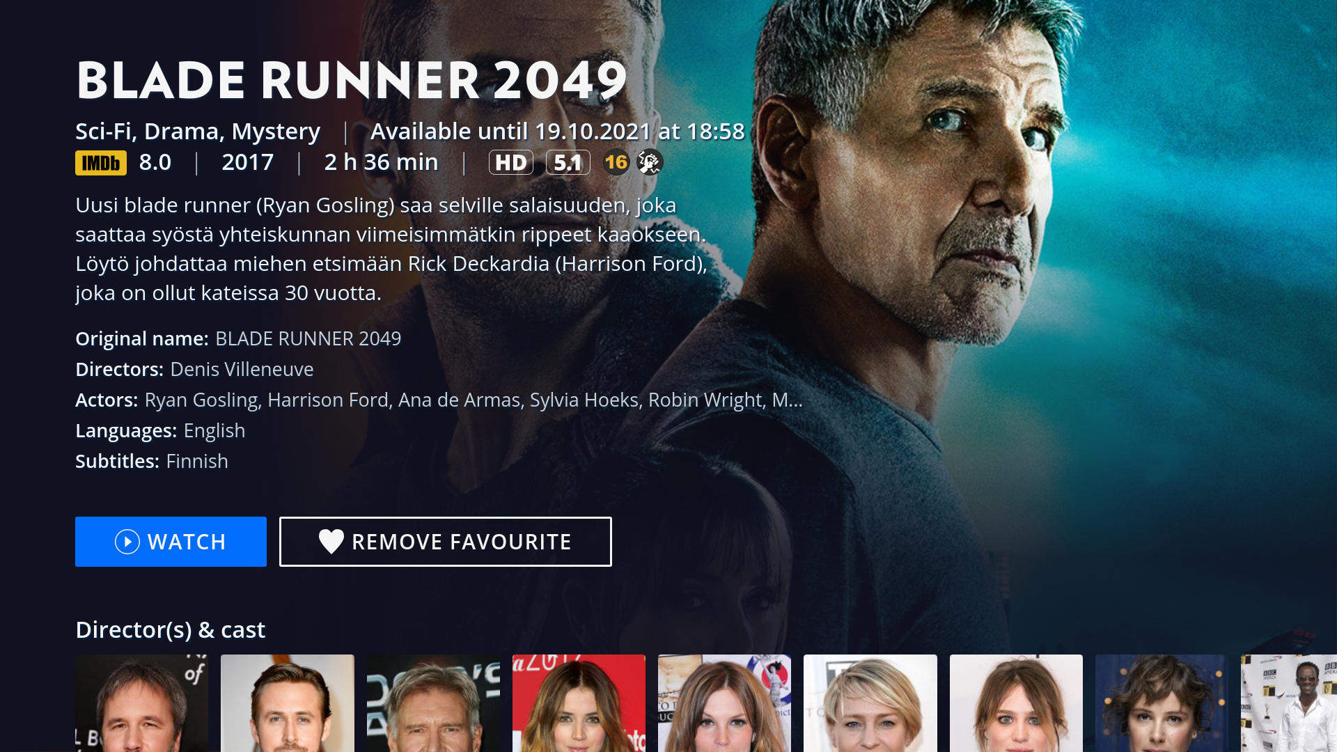
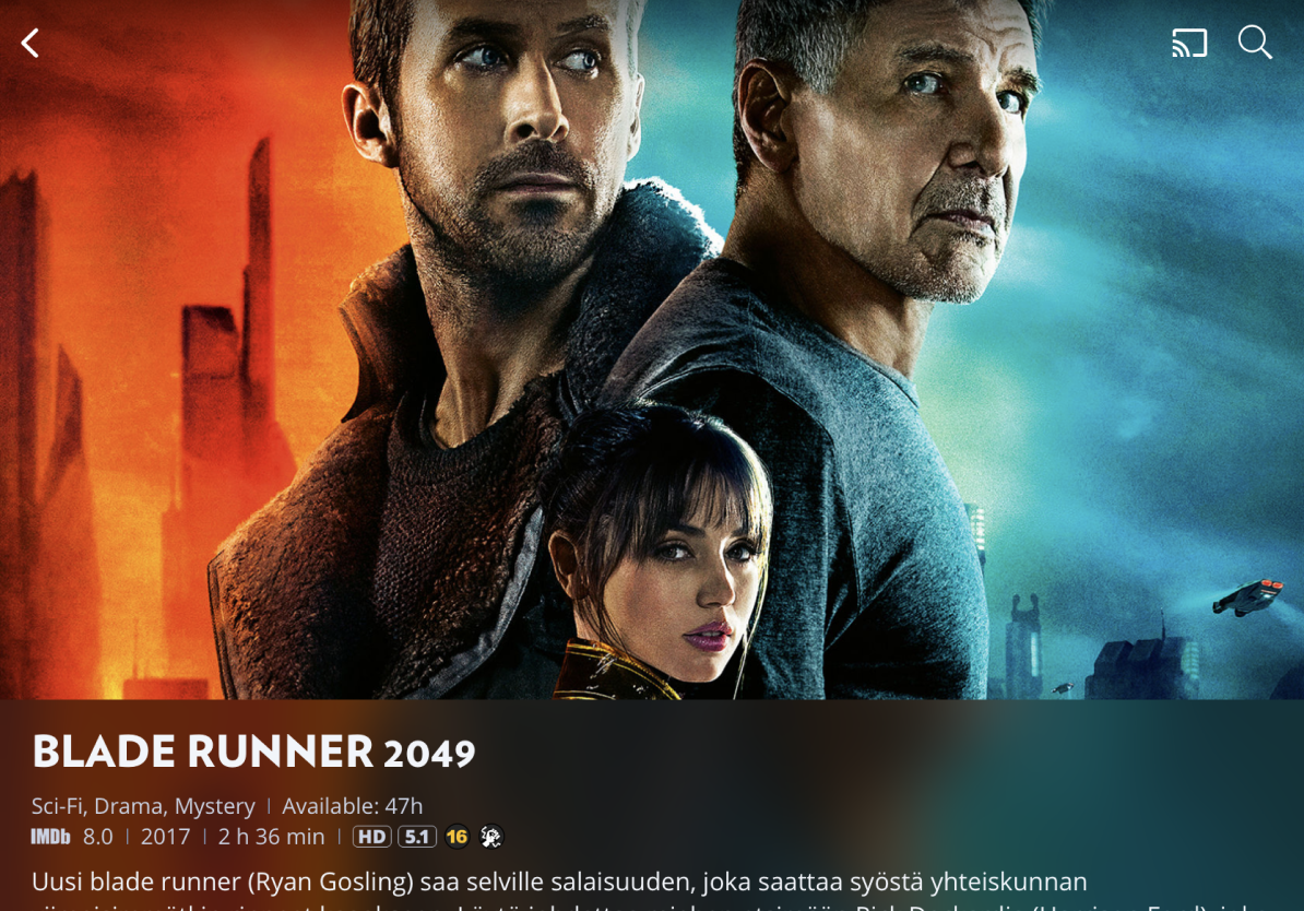
Elisa Viihde Premium
2018 – 2020 • Role: Service Design, UX/UI Design
From concept to flagship product
For Elisa Viihde Premium, I designed most of the user experience, from the very early stages to iterating the finished product.
To design the best experience possible, I worked closely with our user research team to conduct several user studies before and after the launch. We used card sorting, usability tests, focus groups and online surveys (amongst other methods) to get an understanding of what our users want and need.
I worked as part our development team to make sure the designs were implemented properly and effectively. I also worked closely with our technical partner, and designed several functions of the remote (which is a very important part of the TV user experience).
Elisa Viihde Premium is now Elisa Viihde’s flagship product, and it has great customer satisfaction.
Demo video of Elisa Viihde Premium
Other Elisa projects
Besides the projects mentioned above, I’ve worked on several other projects at Elisa. Feel free to ask me about them! They are, amongst others:
- Elisa Viihde Viaplay (2020), a collaboration between Elisa Viihde and Viaplay, where I’ve been on board from the start as service designer of the integration between the services, and UX/UI designer of the onboarding experience of our customers.
- Store concepting (2018 – 2019), to kickstart the renewal of Elisa stores, we did concepting to find out what our customers want and need. I was on board as a senior designer to help the team move forward.
- Etämittaus (2016 – 2017), an e-health service for patients to do home measurements, where I served as a senior UX/UI designer, coaching another designer.
- An internal hackathon (2017), for which I pitched the winning idea: a Tinder-like app that helps people find content they want to watch more easily, without the hassle of scrolling through a lot of irrelevant content. I was the designer in my team, which also consisted of a software architect and a few back-end developers.
- A recent project (2021 – 2022), where I conducted used user research to find out if a proof of concept was good enough to launch to our customers.
My design process
Every project is different and might require a different approach. However, usually my process looks somewhat like this:
I like to get involved in a project as early on as possible, to find the problem worth solving for the end user. This usually requires user research, which I can do myself, but I prefer to do together with user researchers and service designers. Often during this stage I will already start prototyping, first low fidelity and then working towards high fidelity (which will get tested with the customers). During the whole process, I like to work together closely with business and development, to get to a viable solution as quickly as possible. After implementation of a minimum viable product, I’ll follow up again with the users, and define next steps to make the product or service even better.


eHelse
2013 – 2014 • Role: UX/UI design
The Center for eHealth and Health Care Technology is a multidisciplinary co-operation between several faculties at the University of Agder, in southern Norway. They asked me to design a new Electronic Health Record (EHR/CIS) system that would help doctors, nurses, patients and family members keep track of a patient’s progress. The project started for dementia patients, but later expanded to other fields as well.
A webapp
Following the brief, I first sketched wire frames and screen flows, after which I made the visual design, followed by an interactive prototype. Each iteration was fuelled by the feedback of end-users and the results of the usability research of Berglind Smaradottir. In the webapp, different parties have different rights to view or edit things. There is the possibility to (video-)chat with a health care worker, there are to do lists, overviews of different patients (for health care workers), etc. This webapp has specific tablet views, so health care workers can also view the process on the road.
An app specifically for tablets
Building upon the same visual language, I designed a separate app with which patients can upload pulse oximetry test results from their home. The health care workers will be notified if test results aren’t within a certain margin. The app needed to be simple and bold, because some patients would have difficulty understanding technology or reading small letters.

WesAnderson.tv
2012 – present • Role: concept, design, curation
I’m a big fan of Wes Anderson and I’m always looking for new ideas. I saw so many Wes Anderson inspired videos on the internet (behind the screens, video essays, parodies, etc), and I thought I should do something with those videos. Gather them together in one place. When I looked for free domain names I saw that WesAnderson.tv wasn’t taken yet. Suddenly, the idea became very tangible: WesAnderson.tv was born.
It took me a while to get the code to work the way I wanted to, as I’m not a born programmer. I did really enjoy making the website (as Wes Anderson-y as I could), and curating its content.

Engagement
2015 • Role: website & illustrations
When I asked my girlfriend to marry me, I sent her on a treasure hunt featuring lots of illustrations and designs by me. The website with our story is now online as well.

EO Youth Day
2011 • Role: UX/UI design
The EO Youth Day is a yearly event, organised by Evangelische Omroep (Evangelical Broadcasting), one of the biggest broadcasting associations in the Netherlands. The event attracts about 35,000 teenagers every year, and features several well-known artists and speakers. I was asked to do the webdesign for the 37th edition of the event.
At the start of the project, a styleguide was handed to me, along with guidelines of how the back-end of the website would work. It was a challenge to move within the restrictions that the graphic design and the technical part of the website gave me.
After I handed my interface design to the developers, I kept in touch with them to improve the design and interaction elements as much as possible.

EO Video Archive
2011 • Role: UX/UI design • Never published
The EO, one of the biggest broadcasting companies in the Netherlands, asked me to redesign their video archive. There are thousands of videos in the archive, so it was an exciting challenge to try to make it easy for people to find the videos they’re looking for.
Unfortunately, this project was killed because all of the Dutch public media got restructured, so my designs were never seen by the public.